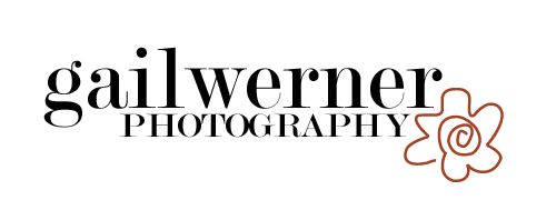
So it's been fun for me to work on a logo that will represent "who I am" as a photographer — for the moment, anyway.
I wanted something fresh, clean, fun, but with enough of a creative touch to maybe help my work stand out in the crowd (given my love of Picasso, that free-form flower was just what I was looking for).
What you see below was put together on the fly (I don't have too much time to be overly concerned with marketing myself when I'm so engrossed in learning so many other things right now) but I needed something to get me going — to help me feel like I'm one step closer to making this* all happen — and what I came up with, well ... I'm diggin' it.
What about you guys? Like it? Love it? Have a suggestion on how to punch it up a bit? (Purdy) please share your thoughts in the comments below — it'd mean a LOT to get a little feedback in the form of some blog love.
*"This" would be a kick-ass photography business where I could rock people's worlds with my images.
Edited post: At the suggestion of friends (and my own personal leanings) the logo I created has been edited to add a "punch" of color. Me likey even more ...


3 comments:
LOVE IT!! I'm jealous!! I need to update my look by I'm too swamped.
My only suggestion is add a punch of color to that flower!
Betsy,
Thanks for the feedback - MUCH appreciated. And I was swinging toward some color myself. I'm thinking an orange or purple.
"swamped" +1
i agree with the color idea. perhaps a second squiggly line of orange inside the flower....(you knew I wasn't going to recommend doing anything in purple, right?)
Post a Comment